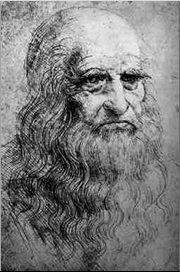
1452 - 1519
"Iron rusts from disuse; stagnant waterloses its purity and in cold weather becomes frozen; even so does inaction sap the vigor of the mind."
—Leonardo—
----------------------------
 Mona Lisa, Leonardo Da Vinci, c. 1506
Leonardo Da Vinci, like other artists of his time, paid particular attention to proportion. In The Last Supper, he sought to create a perfect harmonic balance between the placement of the characters and the background. He did intensive studies on how the characters should be arranged at the table. Also, and it was not discovered until recently, he used a complex formula based on the relationship 12:6:4:3. According to Turner, the entire piece measures 6 by 12 units. The wall in the back is equal to 4 units. The windows are 3 units and the recession of the tapestries on the side walls is 12:6:4:3. These ratios are also very present in music. 3:4 is the interval of one fourth, 4:6 is a fifth, and 6:12 is an octave. It makes sense that Leonardo did this, he once noted on “the resonance between visual and aural harmonies.” He thought making use of this ratio would “offer praise to the harmonies of the universe” (Turner, 213). The image below is somewhat distorted and is not the complete mural, so it is difficult to fully appreciate the harmonic proportion. But this is an excellent example of linear perspective.

Da Vinci elaborated on the relationship between painting and geometry in the first five sections of Paragone, a book written sometime between 1500 and 1505. He said, “the point is the first principle of geometry and no other thing can exist in nature or in the human mind from which the point can originate.” He said the other principles of geometry are the line, the surface and the “body clothed by these surfaces” (Zwijnenberg, 50-1). The Virgin of the Rocks, another very well known Da Vinci piece, incorporates geometry in a more concrete fashion. The arrangement of the four characters (the baby Jesus, Mary, an angel and the infant John the Baptist) is a triangle. The triangle can be interpreted in more than one-way, but once noticed, appears to be in stark contrast to the rich, organic background (Turner, 211).

Virgin of the Rocks, Leonardo Da Vinci, c. 1486
-------------------------------------------------


.jpg)

